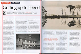
I really like the look of this design but there are element that i dont really like. For example the quote that they have enlarged cuts into the text column and makes it look unstructured and a bit weak in a sense. I really like the fact that they have started the copy off with a 'B' in a larger point size as it really helps to lead the eye to the start of the copy. I think this it an important element as it leads the eye of the viewer down from the title to the copy making them pause for a minute and start to read the text instead of turning the page when flicking through. I will need to incorporate this into my design so that readers dont just flick by.
No comments:
Post a Comment